Trends in Armed Conflict 1946-2014
25 Feb 2016
By Scott Gates, Håvard Mokleiv Nygård, Håvard Strand, Henrik Urdal for Peace Research Institute Oslo (PRIO)
.jpg)
This article was external pageoriginally published by the external pagePeace Research Institute Oslo (PRIO)in January 2016.
Headlines from battlefield in Syria, Libya, Nigeria, Afghanistan, and Ukraine give the impression that the world is becoming ever more violent. Indeed, since 2013 the number of armed conflict in the world and the number of battle deaths has risen. Fortunately, the long-term trends nevertheless driving the waning of war are still at work.
Brief Points
- Since the Korean War, battle casualties have been declining.
- As a result of the civil wars in Syria and Iraq, casualties have risen to the highest level in 25 years, but are still far below levels of the Cold War.
- The number of conflicts has also risen in 2013 and 2014, although much lower than those in the early 90s.
Recent Trends
The number of armed conflicts in the world in 2014 was 40 according to the Uppsala Conflict Data Program (UCDP), the highest sum since 1999. Moreover, the number of people killed as a direct consequence of these conflicts passed 100 000 for the first time in more than 25 years. In terms of both prevalence and severity, in 2014 we witnessed more armed conflict.
Since the end of the Cold War, the trend in armed conflict has been generally downward as seen in Figure 1. Yet in recent years, we have seen upsurges in both the number of conflicts and the severity of war. Does this portend an end to the waning of war?
The number of conflicts increased from 34 in 2013 to 40 in 2014. The number of wars – conflicts with more than 1,000 battle deaths – went up from 6 in 2013 to 11 in 2014. The number of minor armed conflicts increased from 25 to 27, a more modest increase from a historically low level.
The eleven wars in 2014 accounted for no less than 95% of all battle deaths. The 29 minor conflicts account for only 5% of the total. Of these eleven wars, Iraq, Syria, Afghanistan, Nigeria, Pakistan and South Sudan were continuations of ongoing wars. Somalia went from just under 1,000 battle deaths in 2013 to just over in 2014, while the conflict in Israel/Palestine and two minor conflicts Yemen escalated to full war. In contrast to these four cases of escalation, the conflict in DR Congo became less intense. Only two of these eleven wars were new, and both were in the Ukraine, involving different rebel groups opposed to the state.
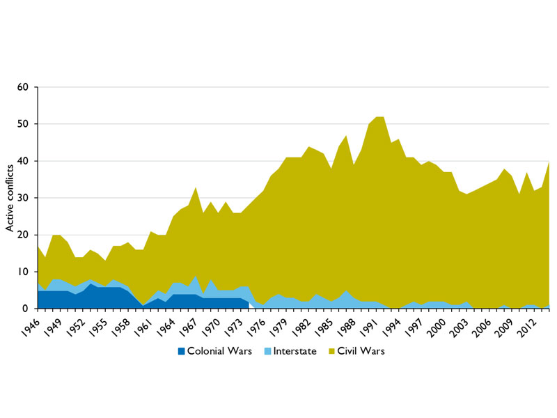
Armed conflict by type, 1946–2014 (click to enlarge)
Trends in Conflict
The Uppsala Conflict Data Program (UCDP), the leading provider of statistics on political violence, has identified 259 distinct armed conflicts since 1946. This includes all organized military conflict over government or territory involving one or more state government(s) and causing at least 25 battle-related fatalities in a year. Figure 1 displays the number of conflicts around the world by type and year since 1946. Two trends over the long term are immediately detectable.
First, colonial and interstate conflicts, which accounted for half of all armed conflict early in the period, have waned. Today, the predominant form of conflict is internal to a state, although quite often involving external state actors.
The second trend is the distinct rise in the number of civil conflicts, peaking in 1991, followed by a decline. 1991 witnessed 52 armed conflicts, in contrast to 2003 with 32. Since 2003 the number of armed conflicts has risen and fallen ranging between 30 and 40.
This pattern of rising and falling numbers is simply due to the onset of new conflicts set against the number of conflicts that end. The steep decline in conflicts from 1992 to 2003 was due to fewer conflicts starting anew than the number ending. The accumulation of conflicts over the course of the Cold War resulted from more wars starting than ending. To further reduce the number of conflicts in the world today not only must we work to resolve the on-going conflicts, but we must also try to prevent others from starting.
Battle casualties do not follow the same pattern as the number of armed conflicts. Figure 2 on the next page shows the number of battle deaths per million in the world (UCDP and PRIO data). (The per capita comparison controls for the growing global population.) The number of battle casualties peaks in the early 50s. Despite the low number of conflicts, this period contained some of the most deadly wars in the post–World War II era, notably the Chinese Civil War (1946– 1949) and the Korean War (1950–1953). Wars, such as Vietnam, Iran-Iraq, Afghanistan, DRC, and Ethiopia-Eritrea account for the subsequent peaks. The general pattern is one of decline, with each peak falling short of its predecessor. The small rise in battle casualties evident today results mostly from the civil war in Syria.
Syria and Ukraine
Two countries account for most of the worsening trend in armed conflict in 2014. UCDP has coded four different conflicts in Ukraine, first the revolution itself and then three regional conflicts in Donetsk, Lugansk, and Novorossiya. These four together are estimated to have claimed the lives of 4 353 people, which should be seen as a conservative estimate.
According to our best estimates, the conflict in Syria now ranks as the deadliest war since the end of the Cold War. Indeed, since 2012 about half of all war casualties around the world have occurred in Syria. Equally troubling is that of the ten most violent conflicts in 2013, eight became more violent in 2014.
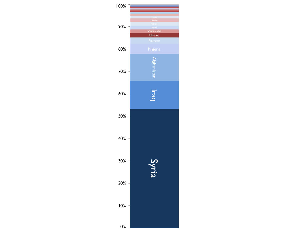
Figure 2: The most deadly conflicts, 2014 (click to enlarge)
Islamic Extremism
Utopian ideologies are a potent threat to peace. In the previous century, fascism and communism were the main obstacles to peace. Today, political Islam presents the gravest challenge.
The figure to the left summarizes all 104 000 people killed in armed conflict over the past year. Of all casualties, 53% occurred in Syria. Iraq and Afghanistan tally at about 12% each. Together these three countries account for nearly 80% of the total battle deaths in 2014.
The colors in the graph differentiate between conflicts where varieties of blue indicate that at least one party is affiliated with some strand of political Islam. Looking at all conflicts around the world, about 90% of all casualties occurred in countries where this particular utopian ideology was present.
This is not the same as stating that 90% of all casualties were victims of political Islam. The blue color merely denotes that at least one of the participating organizations had this orientation.
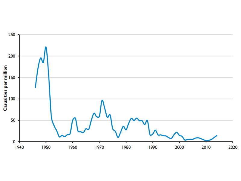
Battle deaths per 1 000 000 people, 1946–2014 (click to enlarge)
Has the waning of war ended?
This is neither a blip nor a trend, but something in between. Only a small pool of countries exhibits any significant likelihood of becoming embroiled in war. For these countries, latent conflict is ever present, ready to escalate to minor armed conflict, or to war.
Since World War II, this pool of candidates has shrunk. Every year some portion of these candidates will experience war or minor armed conflict. The portion involved in fighting thus determines the upswings and downswings in conflict trends. Whether these conflicts continue is shaped by a number of factors, including: the number of actors involved in the conflict, their relative strength, the nature of foreign intervention, and porous borders. Given these factors, we should expect to see the wars in Syria, Iraq, Afghanistan, Pakistan, Ukraine, and Yemen to continue into the near future. Intervention can prolong or end conflict, depending on force preponderance or force balancing.
War severity is a function of similar factors: the number of actors, state and rebel strength, the type of warfare, and outside intervention. The bubbles on the map above show where most deaths due to civil war occurred in 2014. The bubbles are proportion to the number of battle-deaths per 100,000 inhabitants. Presently, this is one of the indicators proposed to track progress along target 1 of Sustainable Development Goal number 16: “Significantly reduce all forms of violence and related death rates everywhere”.
Large bubbles represent substantial battle casualties associated with civil war. Small dots represent armed conflict with low levels of battle casualties. Several large red overlapping bubbles can be seen in the Middle East. Given the number of actors involved in these wars, plus foreign intervening powers, the porous borders, and relative force levels of belligerents, the wars in Syria and Iraq are likely to continue to take their toll in years to come.
In contrast, peace processes at work in Colombia and the Philippines may finally succeed in 2016. We may see these two small dots disappear from our map. The ending of these long-lasting conflicts will also possibly lead to a small dip in the number of armed conflicts in 2016. For the next five years we should expect to see the number of conflicts in the world to remain somewhere between 30 and 40. Since the 1950s, the number killed in warfare has generally declined. Since 1992, a couple of years after the end of the Cold War, the number of armed conflicts in the world fell. Since 2013 we have seen a rise in both the number of conflicts and in battle casualties. Nationalism and religious extremism lie behind much of this up-tick. In the short-run we should not see big changes in conflict trends. In the long-run, however, the slow progress of democratization and development will persist and in its wake will be the waning of war.
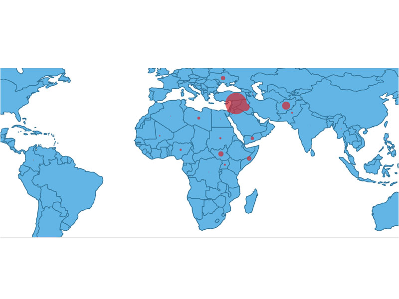
Figure 4: Bubble map of battle deaths, 2014 (click to enlarge)